

As UX designers, we constantly seek opportunities for improvement in user experiences. Today, we wanted to delve into a project that involved redesigning a vital aspect of Calendly, an appointment scheduling automation platform.
Calendly is renowned for simplifying and setting up meetings and appointments, but even great tools can be enhanced. This blog describes the problems we identified, explains why they were chosen, and provides innovative solutions.
Before we dive into the redesign, let’s quickly understand Calendly.
It connects personal and business calendars, making scheduling a breeze. Users share their open time slots, eliminating the hassle of back-and-forth emails. It’s a widely used tool catering to tech-novice individuals and B2B clients.
Users share open time slots in their calendars to book meetings by sending a scheduling link or through embedded times in an email or text message.
This allows you to connect and agree with your invitees on the best time to meet and schedule your meetings without the back-and-forth emails.
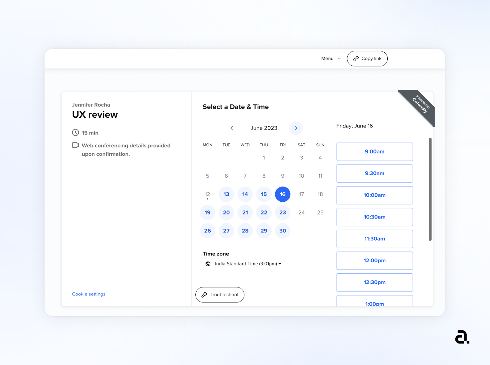
Among Calendly’s many features, the one-on-one event type is one of the most frequently used. This feature allows invitees to select any available time to meet. Given Calendly’s diverse user base, from novices to tech-savvy users, the UX must be simultaneously simple and feature-rich.
Problem: A convoluted or lengthy process for creating one-on-one events can discourage users and lead to frustration.
Example: It can be off-putting if Calendly requires users to go through multiple steps and settings to set up a simple one-on-one meeting. Users may need to navigate various menus or settings before scheduling an event, which can be time-consuming.
Problem: Inflexible UI that doesn’t allow users to customize the scheduling process to suit their needs.
Example: If Calendly’s UI lacks options for customizing event descriptions, questions, or confirmation messages, users might feel constrained. For instance, if a user wants to include specific information or branding in their scheduling flow, limited customization options can be frustrating.
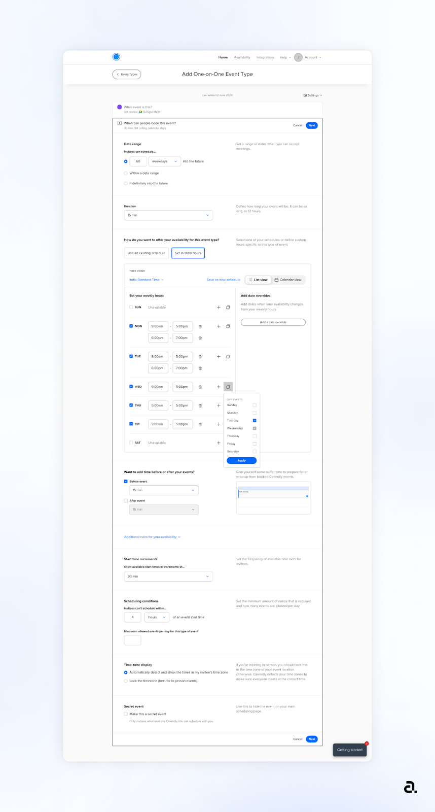
Problem: To create an event, a user has to go through 7 different steps, each with various input fields.
Example: Once the user arrives at step 2 to fill in basic details, after completion, another window of exhaustive input fields opens up as the next step. Not being able to predict task completion and face new screens demanding multiple amounts of information can feel overwhelming.
Problem: Calendly’s UI displays an excessive amount of visual information and elements on the screen, which can overwhelm users and make it challenging to focus on the most important tasks.
Example: If a user simply wants to set up a meeting, they may be bombarded with unrelated information and options that create confusion. This could include too many buttons for different event types, unnecessary animations, or a crowded dashboard filled with data that may not be immediately relevant.
To validate these issues, we looked at user reviews. Some key observations:
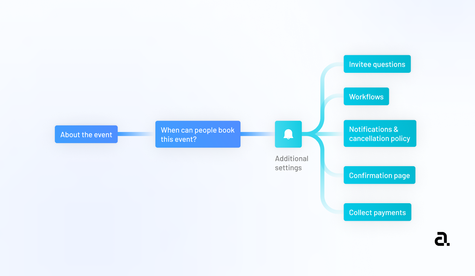
We identified the current user journey and information architecture.
Our observation: Too many steps for comparatively lesser output.
First, we wanted to simplify the entire process of creating an event on Calendly.
In making the process shorter, we combined a few steps to reduce user task load. All the steps which are related to each other are part of one of the steps.
Different steps have different purposes. For example, what you would achieve in 3 steps earlier, you could achieve in 3 steps with the re-design.
A 5 step, versus 7 step process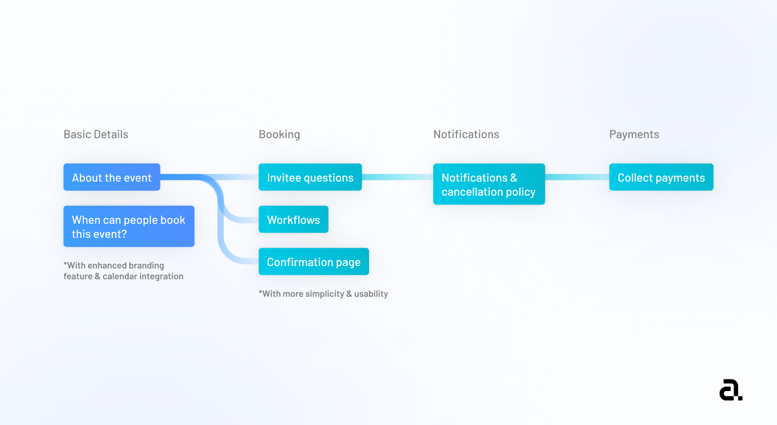
Step 1 : Choosing which event type the user wants to create
Step 2 : Basis the event type, user can block the availability provide basic details, advanced configurations to be set on the appointment.
Step 3 : Setting up the booking form and confirmation settings
Step 4 : Notification settings
Step 5 : Payment setup
In other words, grouping information more meaningfully helps users gain most value out of the time they spend filling information as a chore-function. It helps users make more intelligent decisions by asking for information more efficiently, hence reducing the number of steps a user has to go through to set up their event page.
A lot of users felt that there was a large amount of content on one screen which lacked visual hierarchy making it hard and overwhelming for the users to consume and navigate through the content.
The introduction of a wizard pattern with easy-to-understand sections and display of relevant content reduces the amount of text on the screen, making it easier to focus and consume content.
We divided the content into small sections so that while setting up the event and filling up multiple details, the users look only at one section at a time – the section they’re currently active on. In other words – Instead of a long scroll, the content is reduced down into smaller chunks.
Earlier the entire page was filled with multiple sections (expandable and collapsable) making the page longer and distracting. We have tried to make the experience more focused and faster.
Due to the use of the accordion pattern along with progressive disclosure of the content the user is unaware of the steps involved in creating the event.

This violates the heuristic principle of “visibility of system status” which stipulates that the system status should be conveyed to the user, and they should not be kept guessing. Also, It is hard to locate certain fields in the form structure due to the same reason.
With the goal of wanting to introduce a better way to be aware of the next steps, we added a stepper. The Stepper communicates how many steps the user needs to take in order to complete the process/task of creating an event. Making the next steps visible makes them aware of what’s coming next.
The wizard informs users about all the different sections/ things they can do wrt creating the one-on-one event hence, following the heuristic principle of “visibility of system status”. It is also easier for users to navigate & find the content they would like to fill in due to the prominent section headers & labels.
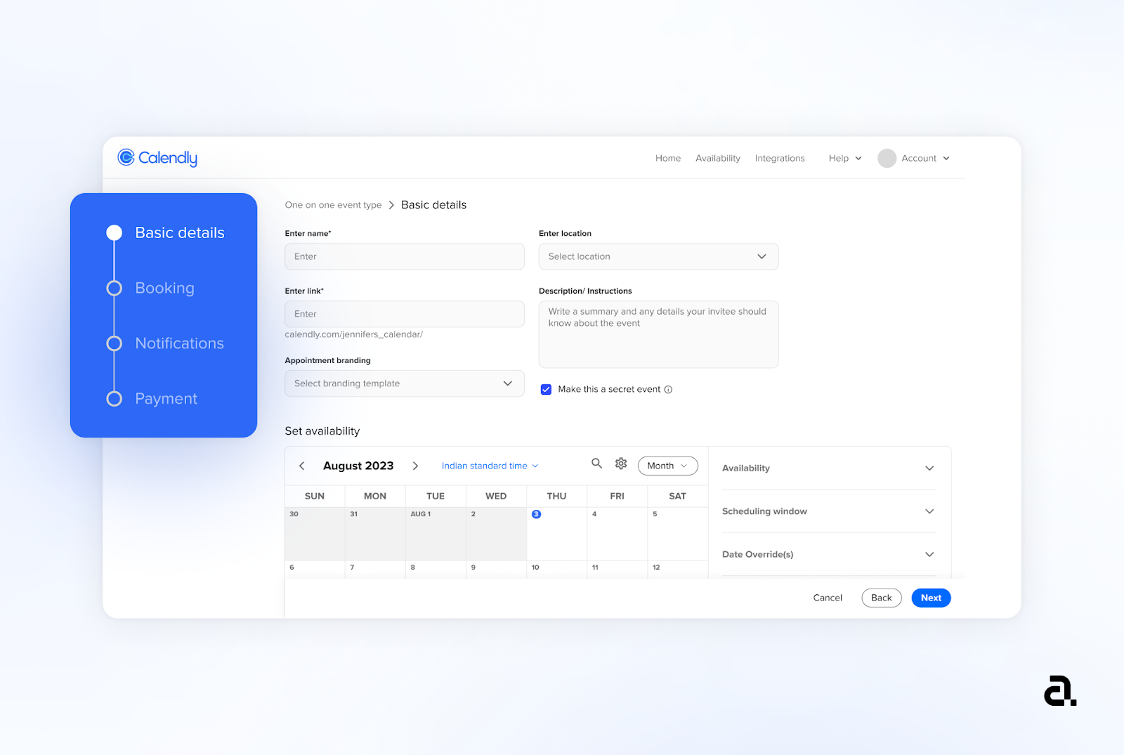
Steppers provide a clear visual representation of the progress users have made and the steps they need to complete. This helps users understand where they are in a process and what comes next, reducing confusion and improving the overall user experience.
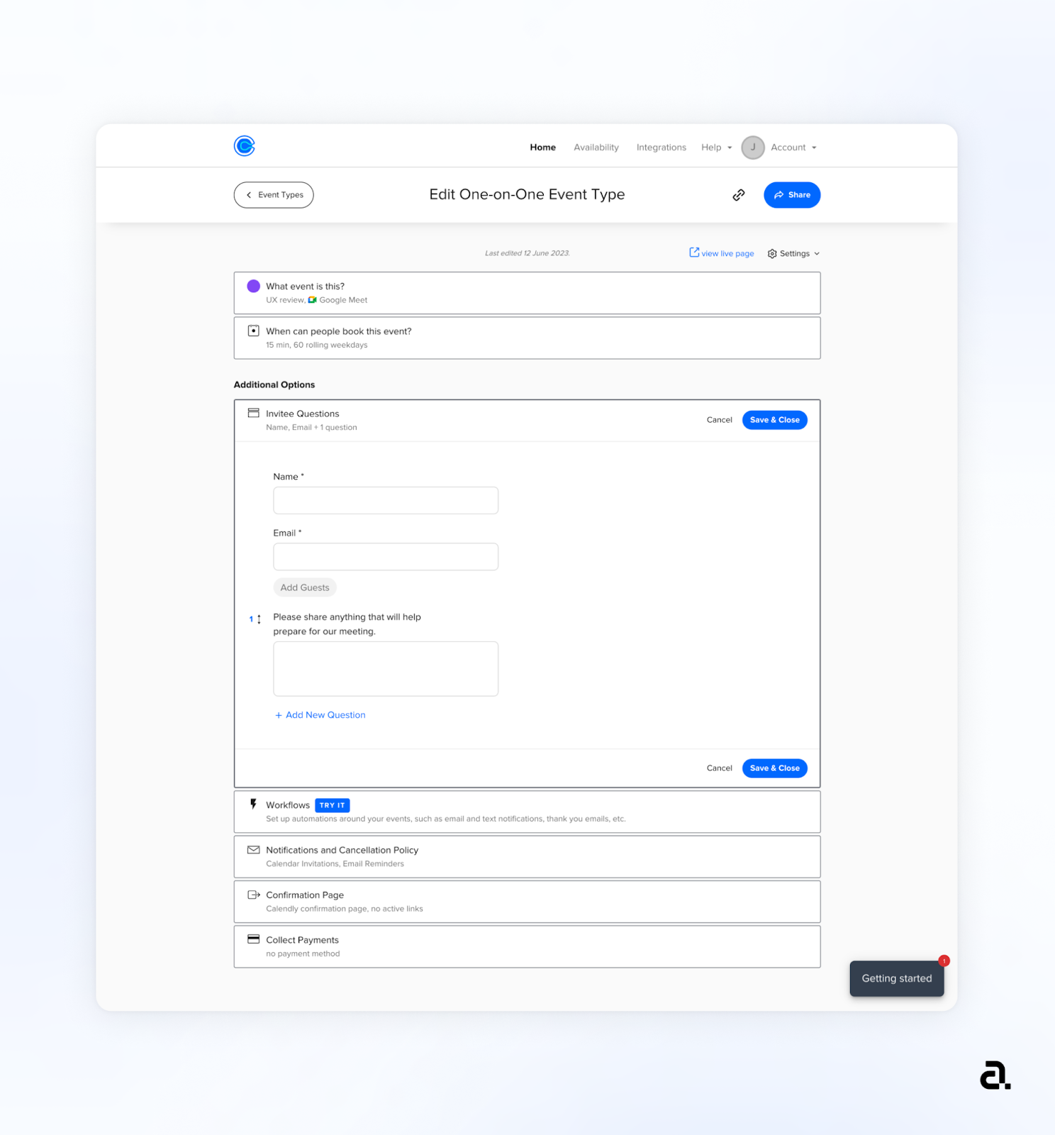
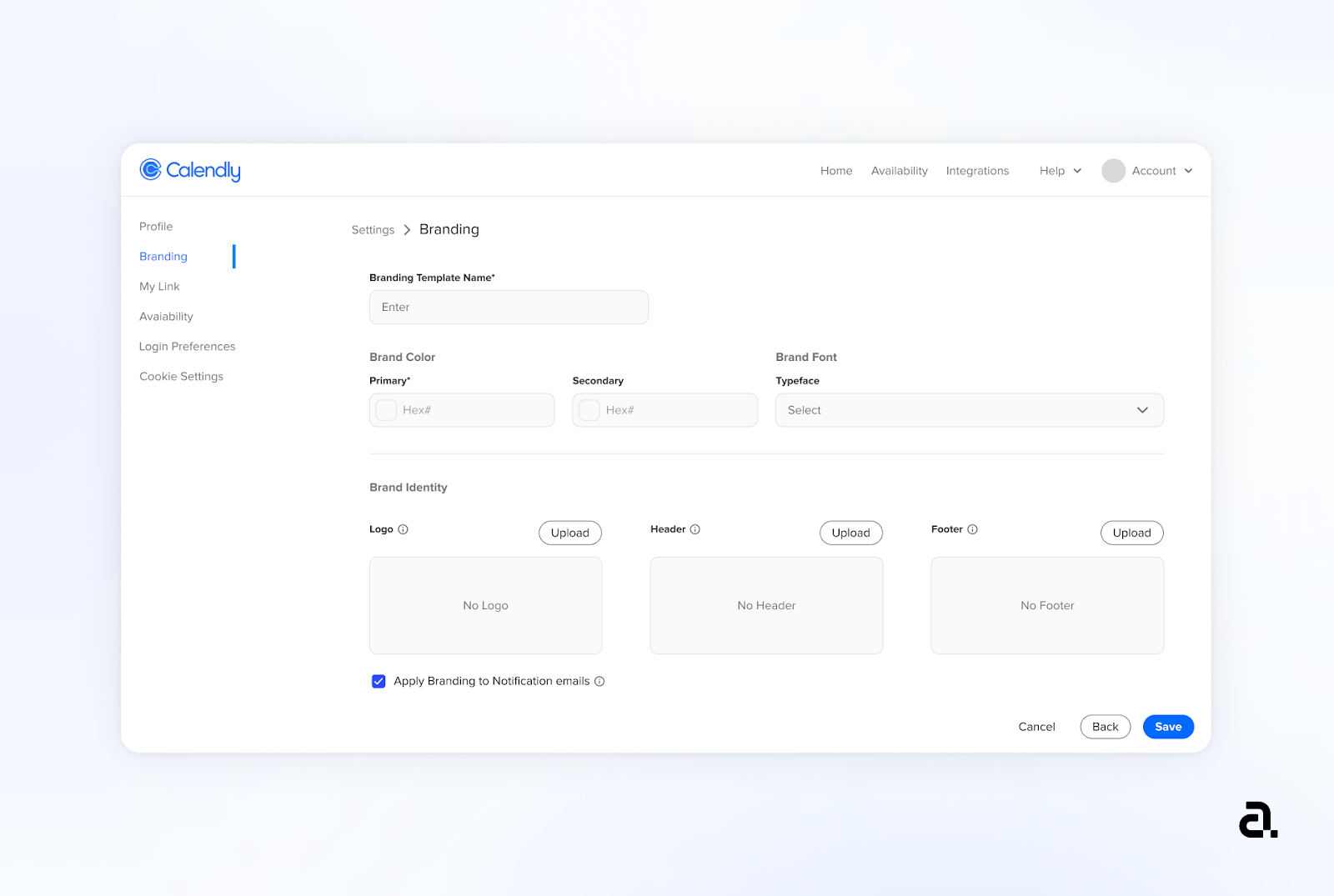
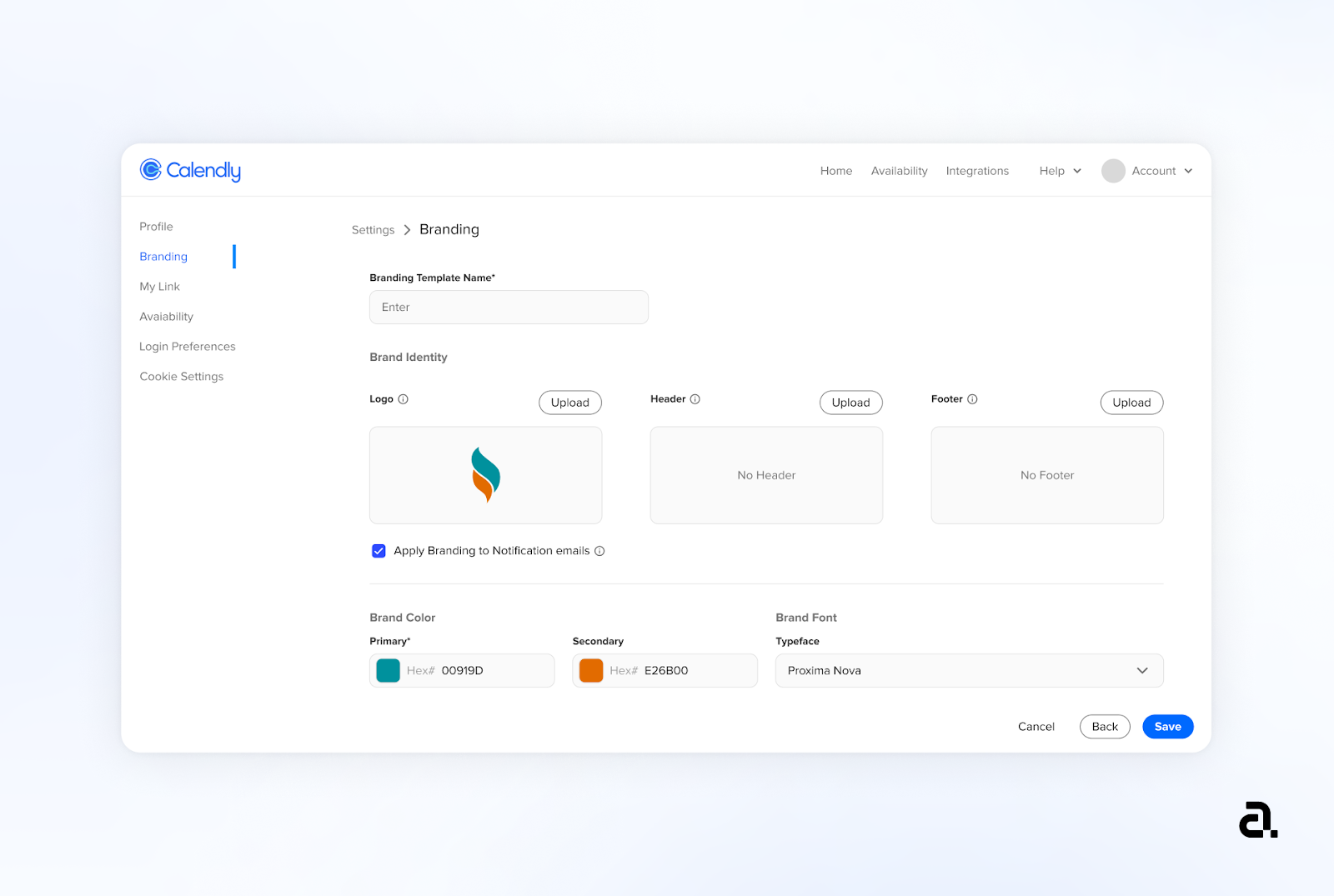
Currently the user has minimal ability to customize/ brand their appointment pages and emails. They can only add a common logo to all their appointment screens. This reduces flexibility and the user’s brand value and exposure.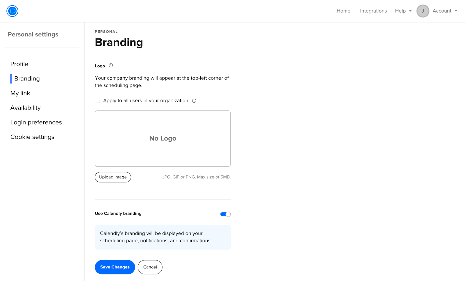
Introduction of a branding feature at the global level (making it available to all event types) that allows users to easily create branding templates consisting of brand color, font & personalized logo for both their appointment pages and emails. The user can then easily choose relevant branding templates for their one-on-one events.
Keeping the branding feature global helps users to create branding templates and leverage them on just one click while they are creating an event.
One : Settings
Second :
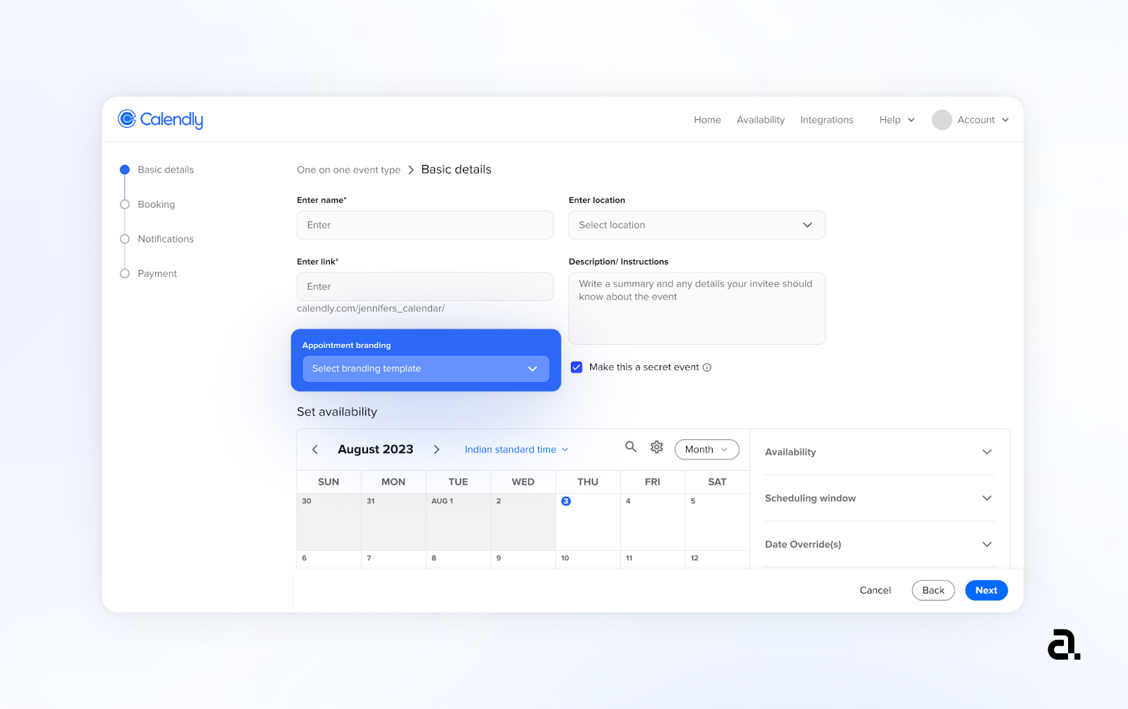
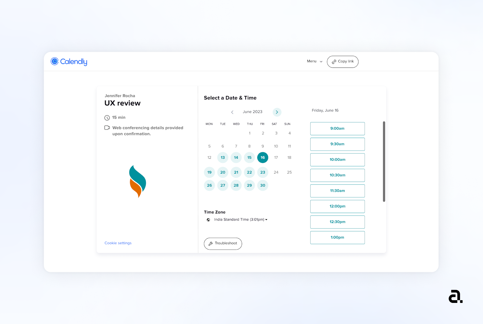
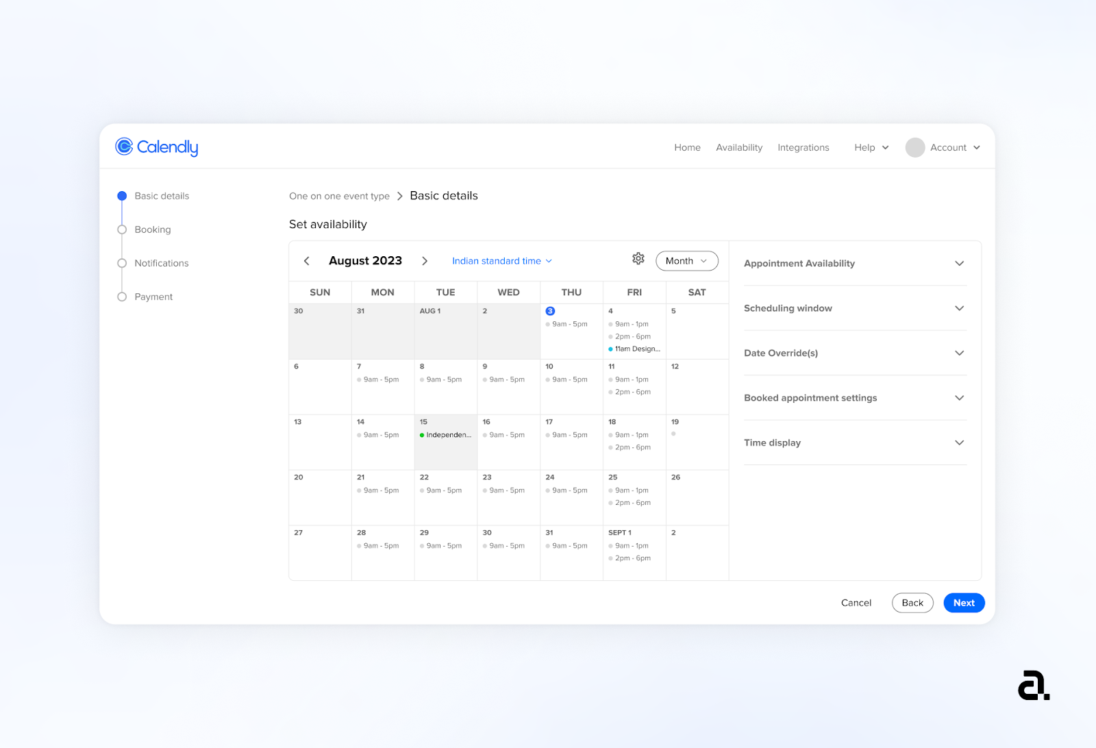
One of the most important features of the application is the ability for the user to set their availability for the appointment page so that users can book slots with them. Currently, the user has a minimal overview of their integrated calendars which may hinder the process of setting availability. Also, it is a lengthy process with a lot of content on screen.
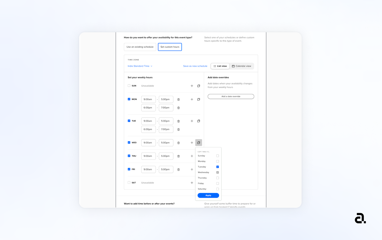
In the new design, set availability has also been incorporated into the basic details section for a more seamless experience. It appears in a new visual form of a calendar view which has been integrated with the user’s other calendars.
The calendar consists of an RHS panel that displays all availability settings, from which the user can choose to populate relevant fields for the event type.


Interacting with the settings will give the user visual feedback in the calendar. This concept & interaction makes it easier for users to consume the content and is more familiar to the user due to Google Calendar.
Calendly works because the product is built into itself. Hence re-designing such a well-loved product was exciting and challenging at the same time.
The aim of this re-design was to enhance the user experience for Calendly’s most used feature. White re-designing a product can be exciting. What decides the success of your outcome depends on time spent understanding users, pain points, market, and trends, rather than concentrating on just the design of it.
To end with a quote that rang often for us while doing this experiment:
“If I had an hour to solve a problem and my life depended on the solution, I would spend the first 55 minutes determining the proper question to ask, for once I know the proper question, I could solve the problem in less than five minutes.”
— Albert Einstein, Theoretical Physicist
UX experiment, research & content for this blog was a combine effort of our two UX team members – Jennifer, and Tanu Khandelwal.